Relentless Grace Radio Website
Relentless Grace Radio is a radio station that streams Christian music 24/7. The owner has asked me to design her radio website. Due to Relentless Grace Radio not really having a corporate identity, I decided to give color to the website by using lots of images. Since the owner is regularly going to change the content on the website, I decided to build this website in Wordpress.
After deploying the first version of the website, I found out that the owner used the website in certain ways I did not expect, so it was time to make some improvements. In the meantime I had learned how to use React.js, so I recreated the entire website within this framework, while also adding features and improving the visual design.
First designs
After talking to the owner, I immediately started designing the interface, because the website should only have one page and this page wouldn't be very complex.
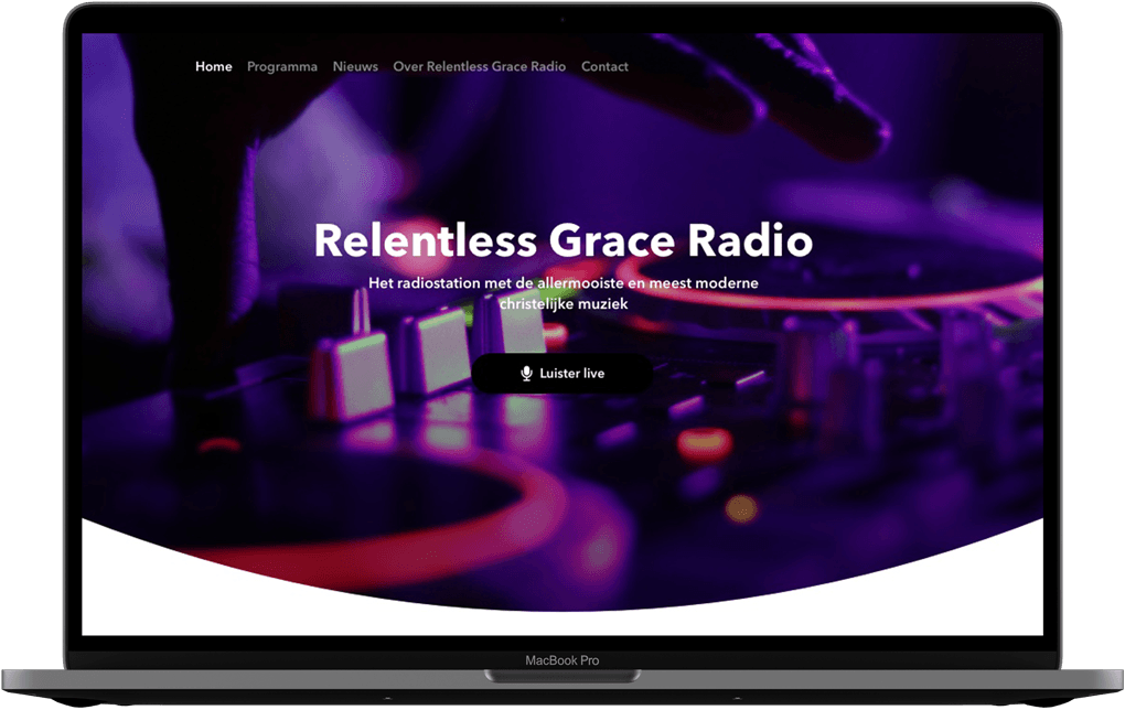
Header Design
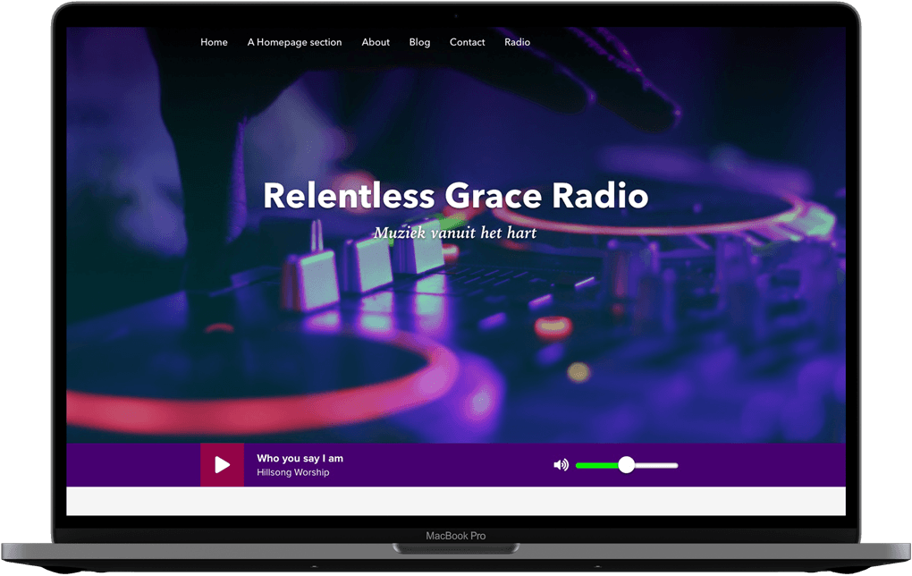
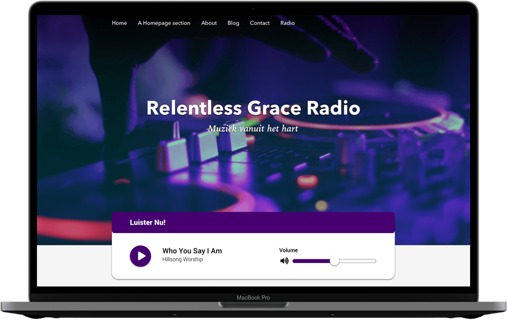
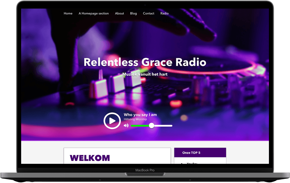
I started out by designing the top section of the page.
Body Design
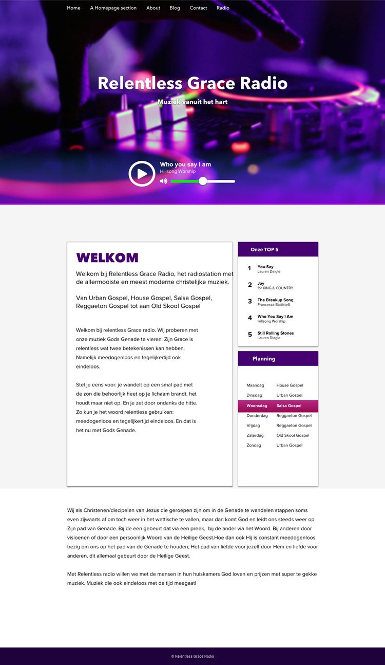
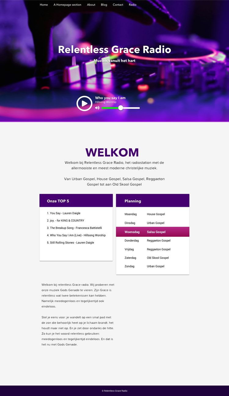
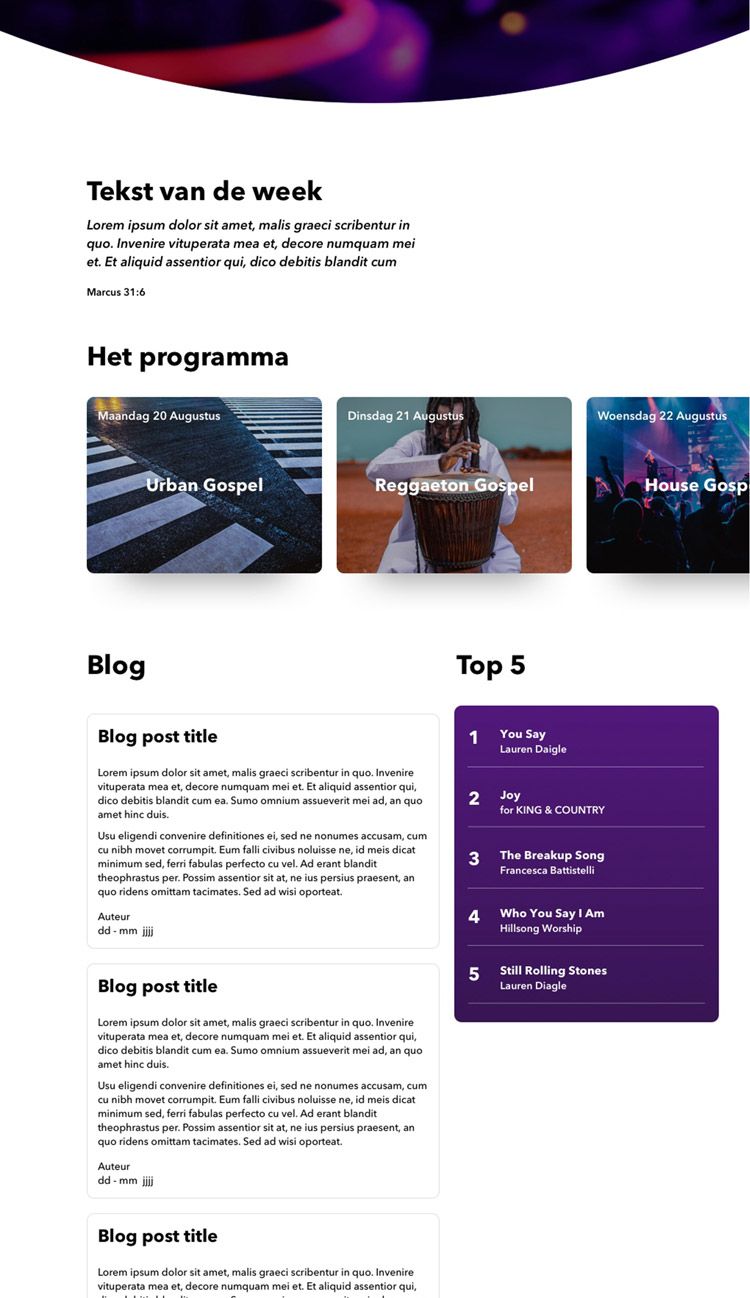
After the header I designed the rest of the page.
Making the website
Since the design of this website was not very complex, I made the website in pure HTML and CSS. For a few micro interactions I used Jquery and Javascript.
After everything worked, I installed WordPress and used the theme “HTML5 Blank” to then put in my own code. After that it was time to put the website online.
Improving the website
When the website was in use, I noticed that the owner used the website in certain ways I did not expect. For example, multiple blog posts were not needed. In addition, multiple fonts were used in the blog post to make text bold or italicized. The font I used for the website not very readable in that way.
Aside from the two points mentioned above, I also saw room for other improvements. In the meantime, I also learned how to work with React.js, so I decided to jump back in to recreate the entire website in React.js, while also adding more features and improving on the visual design.
Wordpress’ REST API
The first challenge I encountered was that I could not dynamically load the data from Wordpress into the React application. After a few Google searches, I decided it was best to use Wordpress’ REST API feature.
Since the website is not very large, I decided to create my own small API by adding a custom endpoint within the REST API, rather than using Wordpress’ standard API.
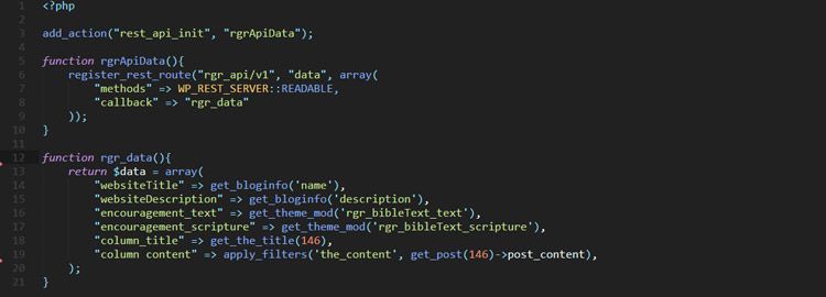
Code to add a custom endpoint in Wordpress' REST API
Font change
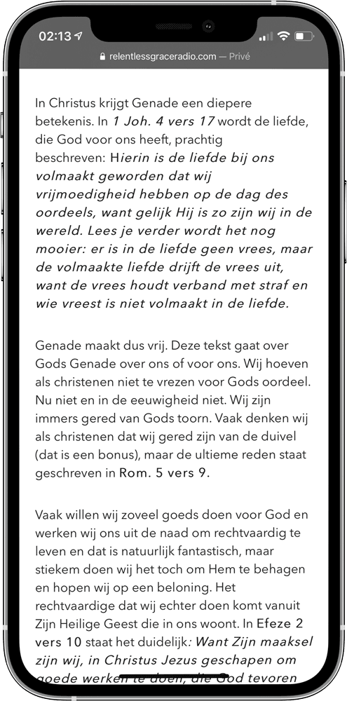
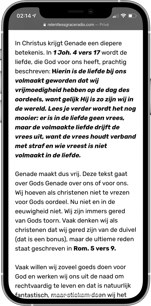
As mentioned earlier, the text was not very readable, because the bold and italic text did not come out properly. So it was time to change the typeface. I have carefully looked at a number of typefaces and paid extra attention to the differences in weight. In the end I decided to replace the old typeface (Proxima Nova) with Rubik.
Proxima Nova
Rubik
Top 5 Interaction
The top 5 section was pretty pointless at first. I can imagine that a user wants to know what these songs sound like. That's why I decided to add Spotify links to the songs. However, not all songs are on Spotify, so in addition I also decided to place YouTube links. The owner can adjust all of this in Wordpress.
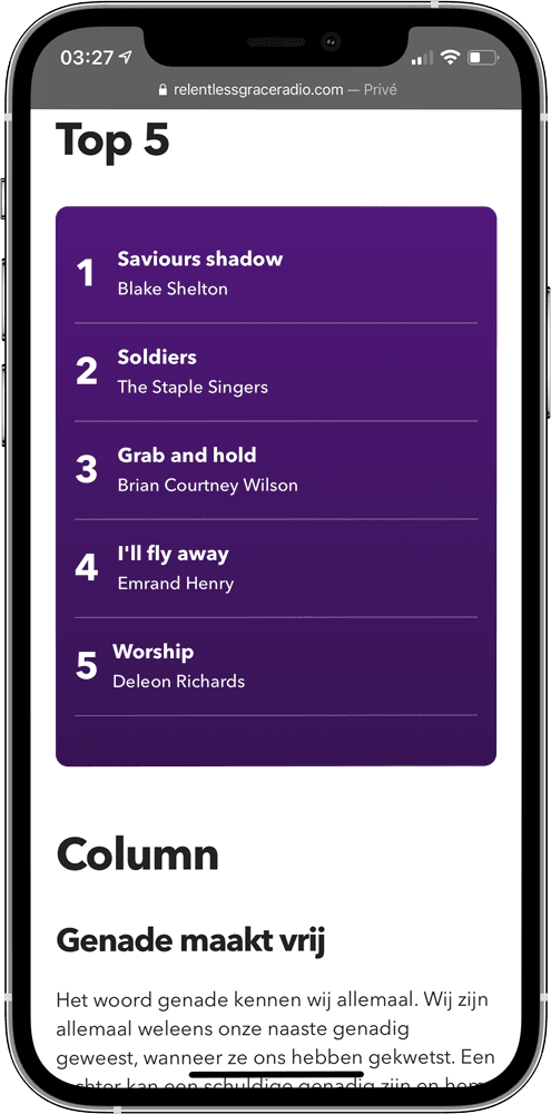
Without interaction
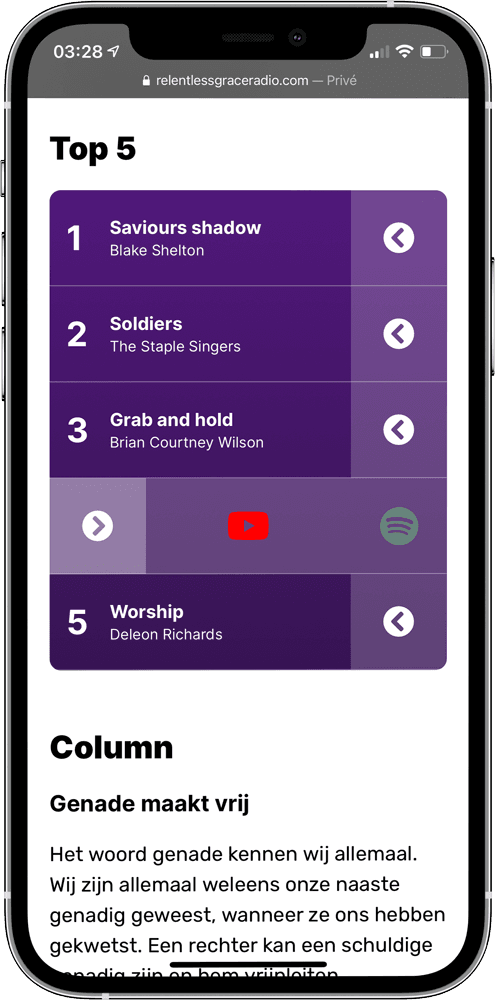
With interaction
Schedule Improvement
There was nothing wrong with the schedule in itself, but I saw room for improvement here. Previously, it was not immediately clear what kind of music would be played the day a user visits the website. I addressed this by making the current day larger. In addition, this day is also centered on the screen when the user visits the website.
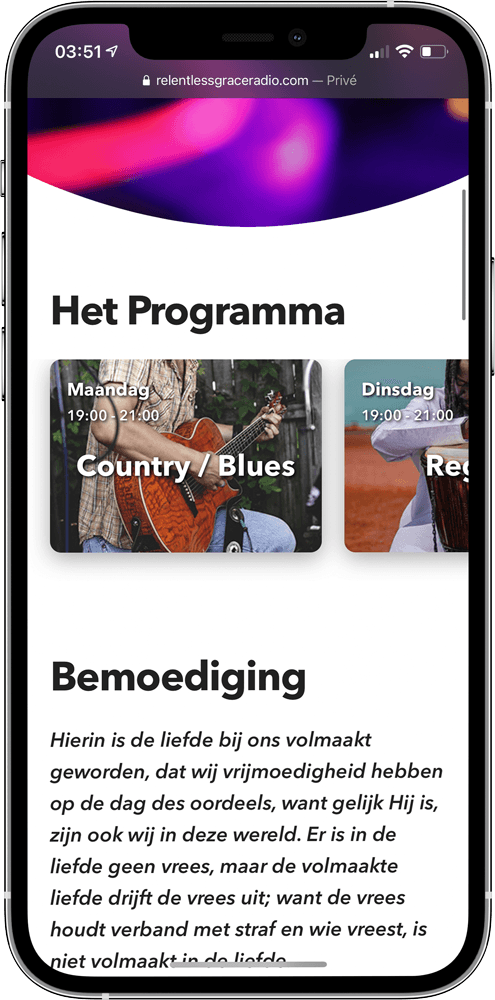
Former schedule
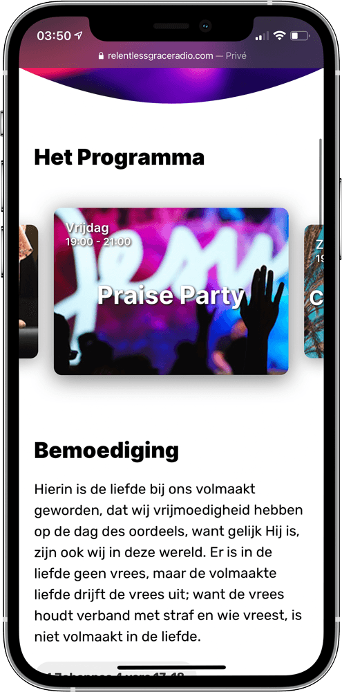
Improved schedule
Logo
To give Relentless Grace Radio a bit more identity and to make the header a bit more interesting, I decided to design a logo. I didn't want to spend too much time on this, so I searched for a font that would suit the website. Since Relentless Grace Radio plays modern music, I also wanted to do something modern with the logo. I decided to go with a handwritten font named “Reey Regular”. Since the end of the letter “R” was very long, I had to make some adjustments in Adobe Illustrator.
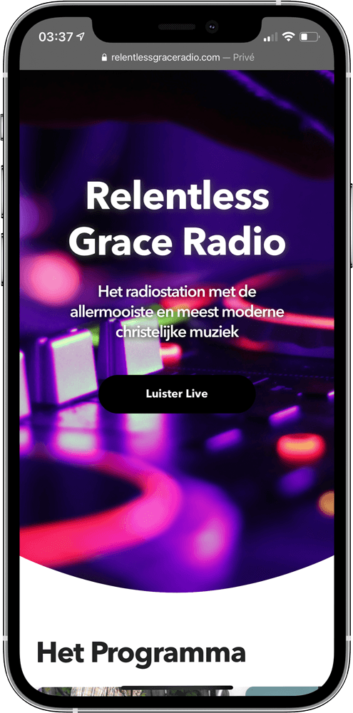
Basic text
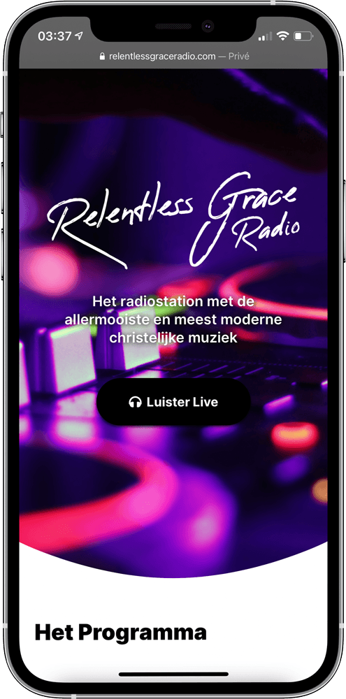
Logo
About text on mobile
Relentless Grace Radio's about text was very long. Because there was already a lot of text at the top, on a mobile it felt like the user had to scroll through a whole piece of text. To solve this, I first took a critical look at the text. I noticed that the most important thing did not immediately come up in the first paragraph, so I decided to rewrite the text. Then I made sure that only the first paragraph is shown to the user. In case the user then wants to read more, they can press the “Read more” button.
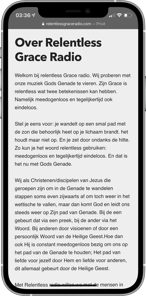
Long text
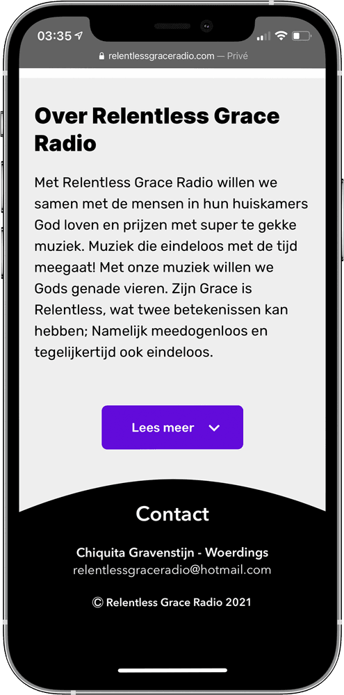
Button to show more text
About text on desktop
On desktop there was another problem with the about text. The text was across the entire width of the page. This was not very legible, so I had to make it smaller. However, this left an empty space on the right side of the page. To solve this I placed an image to fill in the empty space.
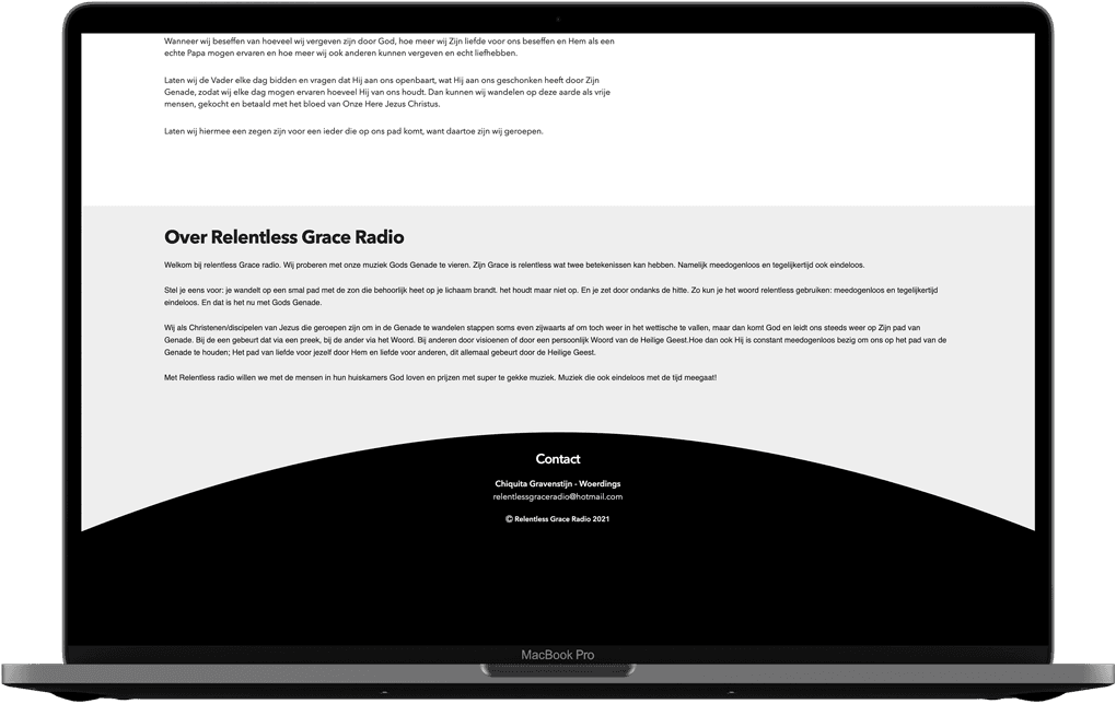
Text across the entire width
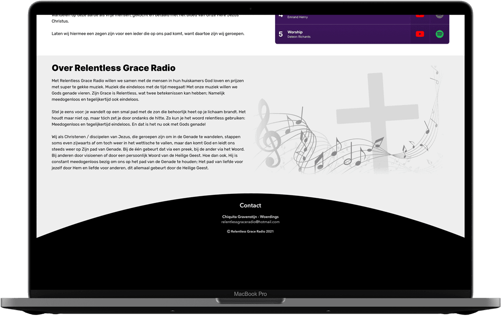
Smaller textbox
Intro animation
Not too long ago I read about Gsap and Lottie to easily add animations to a website, So I wanted to put this on the website as an extra thing. Since the logo was handwritten, it seemed appropriate to do an animation in which the logo is written out. In addition I applied a simple intro animation to the text under the logo with Gsap.
Lottie intro animation for the logo