Logo redesign for Kindercentrul Colors
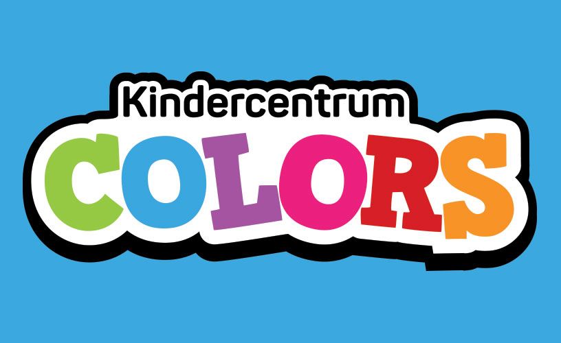
Daycare Kindercentrum Colorful had decided to change their name to “Kindercentrum Colors”. For this they wanted to have a new logo with this name. I decided to take up this challenge and design a logo that fits the current style.
The old logo
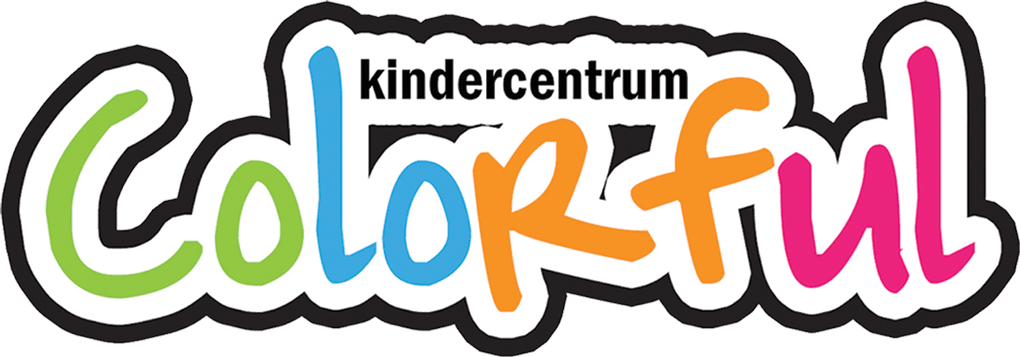
In the image above you can see what the old logo looked like. What I really liked about this logo was that many colors were used to enhance the name “Colorful”, so I wanted to include this in the new logo as well.
The design process
Back to basics
I started out by using a simple sans-serif font while also using the same colors as in the old logo.

Exploring other typefaces
I soon realized that a font like this wouldn't work. It lacked character, so I decided to try two other fonts. The first one was a rounded font. The idea behind this was that it looked more child-friendly because there are no sharp corners. The curves also make it look more playful. The second one was a slab serif font. This idea came up after I saw an image with toy blocks with letters on it.


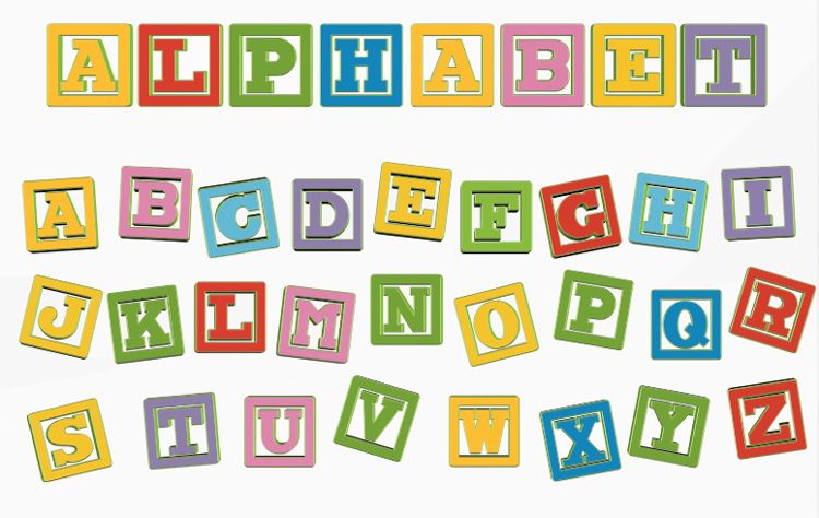
Toy blocks with slab serif characters
Coloring
I soon noticed that the use of color was out of balance, because green and pink were used for two letters while blue and orange were only used for one letter. To fix this, I introduced two new colors that go well with the current colors. As a result, each letter had its own color. In addition, I also slightly rotated each letter to make the logo look more playful. I also designed a variant where there is a gradient on the logo.




Finishing touches
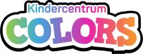
I was happy with the direction the logo design was going, but I also noticed that the logo design was similar to the old logo. I did not think this was necessarily bad, because the new logo could then easily be used in the current visual style of the daycare center. Therefore I decided to keep the same style as the old logo. As a result, I ended up with four different designs that I presented to the customer.


The client's choice
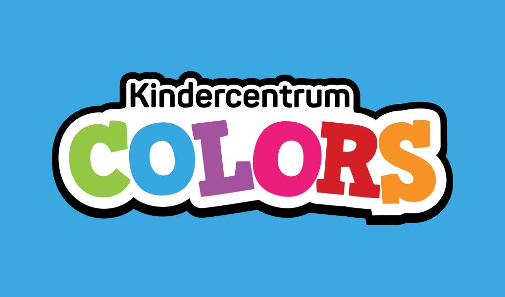
When presenting the logos to the client, I also explained why I decided to keep the same style as the old logo. The client agreed with this. She was also very enthusiastic about the logo's. She quickly made a decision and decided to go with the logo in the image below.
The client's choice